Mish's Global Economic Trend Analysis |

- Reflections on the "Wage Recession"
- 84% of Greeks, 90% of Greek Businesses Have Difficulty Repaying Loans
- Real Disposable Income Down 4%, Reversing Strong Gains in December
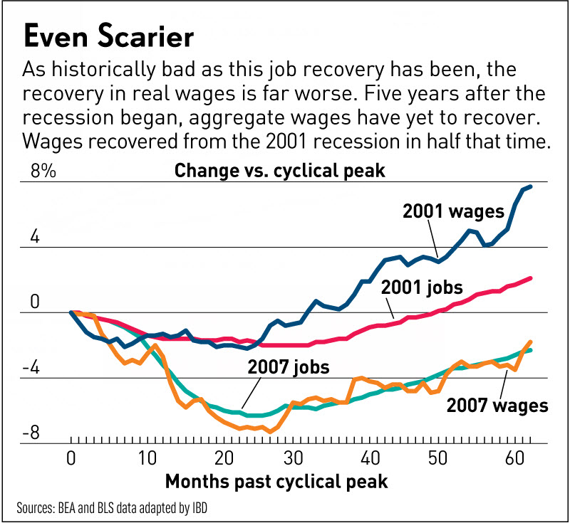
| Reflections on the "Wage Recession" Posted: 01 Mar 2013 12:27 PM PST Jed Graham at Investor's Business Daily has an interesting chart showing Wage Recession Hits 5 Years; Worse Than Jobs Drought. I can show it's even worse, but first let's consider a chart and commentary by Graham. As bad as the current job recovery has been — and it's by far the weakest since World War II — the recovery in wages has been far worse. Real Disposable Income Instead of looking at wages, let's consider real disposable income as a measure of the "wage recession". Here is a chart from Doug Short at Advisor Perspectives on Nominal vs. Real Income. Real Disposal Personal Income Per Capita 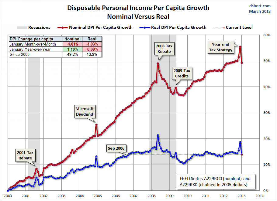 click on any chart for sharper image That chart shows an income recession for six years. I suggest the wage and income recession is even longer if one looks a breakdown of median income. I commented on this previously in Top 1% Received 121% of Income Gains During the Recovery, Bottom 99% Lose .4%; How, Why, Solutions. Also consider my followup post Reader Asks Me to Prove "Inflation Benefits the Wealthy" (At the Expense of Everyone Else). Real US Household Incomes 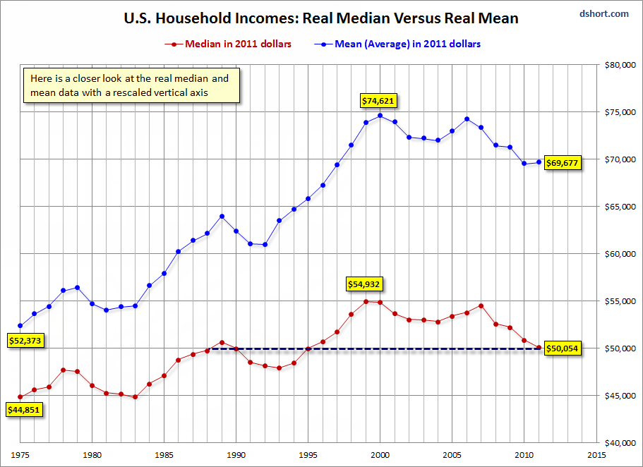 In "real" (CPI-adjusted) terms, 50% of households are no better off than they were in 1988. Let's dig a litter deeper. Growth in Real Household Income by Quintile  The above chart shows percentage income growth by quintile since 1967. Since 1988, the bottom, 4th and middle quintiles (a combined 60% of households) have negative real income growth. The next chart shows the same thing in a different way. Real Household Income by Quintile  No matter what your timeframe, only the top quintile did well. And from 1980 until 2000 the top 5% got the lion's share of income gains. How Long a Recession? Those in the top quintile have arguably had an "income recession" for 13 years! Only those in the top 5% have had real gains. Those in the bottom three quintiles have not seen any improvement in real income since 1988 or longer (25 Years)! To be fair, some people have moved up from quintile to quintile (or up within a quintile). However, unless someone moved up to the top quintile (if not the top 5%), inflation adjusted income growth has been a real struggle for a long time. Mike "Mish" Shedlock http://globaleconomicanalysis.blogspot.com |
| 84% of Greeks, 90% of Greek Businesses Have Difficulty Repaying Loans Posted: 01 Mar 2013 11:20 AM PST Think Greece has been "saved" by the Troika? A quick look at some loan repayment stats may help you think clearly. Please consider More than 80 pct of Greeks are having difficulties repaying loans. At least eight in every 10 citizens who have taken out a loan are having trouble with repayment, while the problem is greater among households with children and those from the lower social strata, according to a survey conducted by Public Issue for the 2012 period.Greek Banks Insolvent That loan data highlights what any clear-thinking person already knows: Greek banks are insolvent and will be in need of still more recapitalization. Mike "Mish" Shedlock http://globaleconomicanalysis.blogspot.com |
| Real Disposable Income Down 4%, Reversing Strong Gains in December Posted: 01 Mar 2013 08:59 AM PST The Bureau of Economic Analysis report on Personal Income and Outlays for January shows a 4% decline in real disposable income (the biggest decline in 20 years) following sharp gains in December. Personal Consumption Expenditures (PCE) eked out a .1% month-over-month gain. Personal Income and Outlays, January 2013 December to January Wild Swing Expected The December to January swings were generally expected (at least they should have been). Corporations brought as many wages and bonuses forward as they could to avoid 2013 payroll tax hikes. The surge in the December savings rate and the surge in December personal incomes were essentially a mirage. Big Four Indicators Dough Short at Advisor Perspectives does an interesting report every month on "Big Four" indicators: Industrial Production, Real Income Minus Transfer Payments, Employment, and Real Sales. "Real" means inflation adjusted.  click on chart for sharper image Notes:
As per Short "The -4.7% decline in January essentially cancels the 1.4% rise in November and 3% rise in December. The January year-over-year number probably gives us a better sense of the economic reality: Personal Incomes Less Transfer Payments are essentially flat -- up a tiny 0.7%." Looking Ahead in 2013 Looking ahead, expect to see declines in real personal incomes on a year-over-year basis (an artifact of the end of the temporary 2% payroll tax cut). Sales tax hikes, especially in California (as a result of proposition 30), will take a further bite out of disposable income. I think this will matter more than most economists have figured. 2% payroll cuts may not be much to upper income groups, but it will hit disproportionately hard on low-wage earners who ten to spend every cent they make. Mike "Mish" Shedlock http://globaleconomicanalysis.blogspot.com |
| You are subscribed to email updates from Mish's Global Economic Trend Analysis To stop receiving these emails, you may unsubscribe now. | Email delivery powered by Google |
| Google Inc., 20 West Kinzie, Chicago IL USA 60610 | |
No comments:
Post a Comment